Understanding Color Modes Used in Design: RGB, CMYK and PMS
- Donna DeLeo
- Jan 21
- 3 min read
“Color is my day-long obsession, joy and torment…,” said the visual designer. Actually, it was Claude Monet, the famous French impressionist, who coined this popular quote; but any designer worth their salt can relate.

In marketing, the colors we choose become an integral part of a company’s brand and as such play a crucial role in the first impressions customers will form. Color is an unspoken, visual language and designers will spend hours toiling over their color books to choose just the right shade of a hue to use in a logo design.
Once our color selections are woven into a corporate identity, they are broadcast out to world across a multitude of channels. Digital and print assets are just the tip of the iceberg—there’s signage, exhibit graphics, presentations, promotional giveaways, clothing…you get the point. As marketers we have the formidable task of ensuring that the corporate palette remains consistent across these mediums and stays true to the integrity of the brand. Consider McDonald’s golden arches and a specific shade of yellow will come to mind. Or what about the jewelry company, Tiffany’s—their robin egg blue packaging is recognizable to any fashionista. It’s these specific hues that customers identify with the company over time.
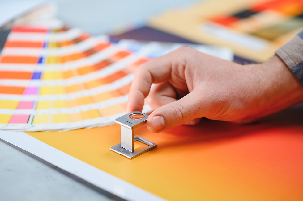
In graphic arts there are numerous color systems used to accurately measure and describe color, but the 3 most essential are RGB, CMYK and Pantone
Let’s start with the RGB color model. It’s used in electronic devices such as computer monitors, smart phones, TVs and digital photography. It’s an additive color model in which red, green and blue light are added together to create a broad array of colors. Each color (red, green, and blue) is assigned an integer between 0 and 255 that defines its intensity. For example, RGB(0, 0, 255), red and green have been assigned a value of 0 and blue the highest value of 255. This color would render on screen as a vivid blue.
On the other hand, CMYK is a color model we use for commercial printing. Cyan, magenta, yellow and black (CMYK) ink dyes are mixed together on press to create an array of colors. CMYK is also referred to as four-color process printing. For example 0% Cyan, 100% Magenta, 100% Yellow, and 0% Black; Magenta and Yellow inks are mixed together in equal amounts without any cyan or black. This would appear as a red when printed on paper. It’s important to mention certain RGB colors that can be seen on a screen—in particular, bright vibrant colors—simply cannot be replicated with standard CMYK inks.
The CMYK color model is only one way we can express color for commercial printing. The Pantone Matching System (PMS) is a proprietary numbering system for colors. It is solid ink color printed on paper—not mixed on the press, as is CMYK. Solid color (also know as spot color) is the truest representation of color intent and results in a very pure hue. When color matching in print is absolutely critical use PMS color if your budget allows.
Through the course of a brand’s life many hands will touch it—developers, vendors, UX and web designers, and printers—to name just a few. Therefore, it’s critical to include color specifications in your Brand’s Guidelines. Below is an example of one color—a magenta hue—and how it would be documented using the 3 color models described:

So, while color may be a designer’s day-long obsession… for everyone else thereafter it can be much easier. That is, as long as you have your designer measure and record their color selections in these three color systems.